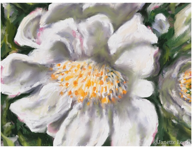
On the veranda the other day I noticed the Camellia bush was in bloom. It has lovely crinkly white flowers; some of the petals are edged with a hint of pink. It should go into the garden soon, yet it is doing very well in a pot. I decided to paint it..this is the finished painting above and below are some of my painting processes.
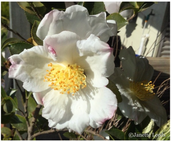 I took a photo for reference and began a painting of it on my ipad in the “Art Set Pro” app. *I use my finger, rather than a stylus.
Some Painting Steps
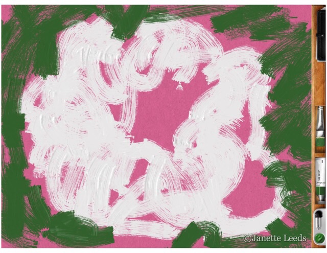 I began on a pink surface. As you can see at the right; quite a strong pink. I liked the way the white and greens looked so fresh on it. It was only towards the finish of the painting that I realized it was just the right colour for the pink petal edges and used an eraser in places to reveal it. Not something you can do with a canvas and paint – very handy.
 Composition.

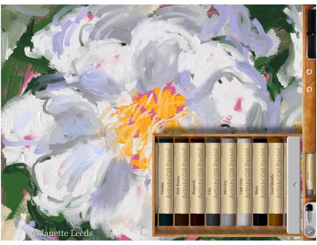
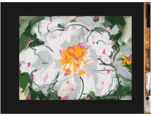
Then, I added the greens and the other flower, in the background to the right of the main flower..I wanted to capture more of the gold stamens. I decided it would also help the overall composition by reflecting and establishing the main focal area – the middle of the large flower. However, I think the the gold colour of the stamens and the tight cropping, already brings the viewers eye strongly to this focus point. I used a little oil pastel along the way.
It’s handy to be able to enlarge part of the painting, at times to do some detail work. As can be seen here


on the left. After working on my painting on and off for a few hours, I realized that all of the inner flower colour needed changing. If you compare finished painting at the top to this one here, below; you can see the colour here has a more lilac hue.
I relooked at the flower and photo, and proceeded to mix up some greenish paint wash which I painted across the middle part of the painting. Then I smudged it a bit. You can see in the finished painting, I left in, some of the lilac.
In Conclusion.
There is a tightness to my finished painting, which I don’t like much. I usually achieve an agreeable level of loosness in my drawings, and I’d like that effect more in my finished paintings. To a degree, I can manage this in my watercolours, but struggle with it when I paint in acrylics – I rarely use oil paints.
With all its faults, it finished up ok, (hmm, should have made the petal edges more crinkly) and actually printed up quite nicely.
I think I just need to do a lot more painting. Yes, I know this is paint in an art app, yet the way I have to work with it, is surprisingly similar to the way I paint on paper or canvas!
Practice, practice, practice..always a good thing; whether on paper, canvas or iPad. 🙂


Absolutely lovely!
LikeLiked by 1 person
Thank you! 🙂
LikeLike
Great thing about ipad drawing is not having to have a lot of stuff! Imagine that for plein air art! Some of the processes are similiar. Are using a stylus or…?
LikeLiked by 1 person
Hi, I use my finger..prefer that to a stylus. Yes, iPad art has a lot of good points…and it’s good fun! I’m also a fellow Australian…such a great place to live. 🙂 Really like your art. Looking forward to seeing your future posts.
LikeLike
This is lovely. Iwhat a pretty flower. great work. I love the texture of the paint on it! great idea to take progress screenshots I never thought of that 🙂 inspring me as always 🙂
LikeLike
Thank you. 🙂
LikeLiked by 1 person
Lovely post! It came out gorgeous and I love that you have a veranda. Any drawing of that?
Linda
LikeLike
Thank you Linda. Verandahs are very popular over here in Australia. No drawing of it yet, but maybe one day…sounds a good idea. 🙂 Have a great day…Janette.
LikeLike
Lovely work, Janette! Really so much like hand-painted, it’s incredible. Since I haven’t seen that app – does the photo inset of oil pastels pop up through the app, so you can choose colors? When I first looked at it, I thought you were actually using those pastels.
LikeLiked by 1 person
Thank you Pat. 🙂 This is definetly my favourite art app. Not only is the quality of the media amazing, but the way it is visually presented also makes it a delight to use. As you can see by the oil pastels..( or paint tubes, conte crayon…and so on..I really love the charcoal in it too) You roll through the tray to find the colour you want, (sort of hard to describe) also you can mix your own colours. There is more pictures and info about this app, on my page, ” About Some Art Apps, Other Apps, and My Books.” All the best, Janette. 🙂
LikeLike
Lovely flower painting, Janet. And seeing the ipad painting process is interesting. This a great way to capture emphemeral subjects like flowers.
LikeLiked by 1 person
Thank you Maria. 🙂 Overall, it really is a great (and fun) way to draw and paint.
LikeLiked by 1 person
Lovely!
LikeLiked by 1 person
Thank you. 🙂
LikeLike
Fabulous art Janette!
LikeLiked by 1 person
Thank you Sharon. 🙂
LikeLike
Amazing…wonderful work!
LikeLiked by 1 person
Thank you for your lovely comment! 🙂
LikeLike
I like the one at the bottom of the post best. It has more freshness, and I like the purple in it. I like how you used the pink background. Thanks for sharing your process. I like the paint and oil pastels best too. It seems like the oil pastel is good for the the tight areas, instead of trying to get them with the paint brush and blending it all together. I’m still a little tighter than I want to be in Art Set Pro, because I’m still adjusting to the feel of it.bKeep up the good work!
LikeLiked by 1 person
Thank you. 🙂 I agree with you about the paint and oil pastels, they’re lovely and my favourite to use ..I find I use the oil pastel like that sometimes, though I’m getting used to the finer brush…and given time, I’ll experiment more with the other media..the charcoals great…the wax crayon is interesting, …what a great app it is. Thank you Tracy for liking my facebook page and all those likes! You’ll get a double dose of my work! 🙂 As these days, I tend to just use publicize for my WordPress posts and they then go straight to my facebook page..not much time to add a seperate post there. And as it was, before I had my blog, facebook hardly shared my posts to anyone; they keep suggesting I pay for that service, which I wont be doing! I’ll keep my page going, it’s still a way for some people to see my artwork. My comments can get rather long!- better go, housework to do, and hope to have time for some arty adventures. All the best, Janette.
LikeLike